

How to Create a Dynamic Slicer Using Field Parameter in Power BI

Updated: Sep 17
Power BI's Field Parameter feature lets you build a dynamic slicer where end users can switch the dimension or measure being analyzed across multiple visuals, all without needing separate charts or slicers for each field.
Instead of building four bar charts for City, Country, Department, and Job Title, you build one. The user controls what they see by clicking a slicer powered by the Field Parameter.
What Is a Field Parameter in Power BI?
A Field Parameter is a Power BI feature that creates a selectable list of fields or measures, which can then drive what a visual displays. When a user selects a value from the parameter slicer, every connected visual update to reflect that field. This replaces the need to:
Build separate visuals for each dimension
Use multiple slicers to control different charts
Create complex DAX measures to simulate dynamic axes
Field Parameters are available under the Modeling tab in Power BI Desktop.
When to Use a Dynamic Slicer
A dynamic slicer using Field Parameter is useful when:
Your report has multiple dimensions that apply to the same visual (e.g., analyzing salary by City, Country, Department, or Job Title)
You want to save canvas space by consolidating visuals
You want end users to explore data on their own without switching report pages
The number of values within a dimension is large and needs further filtering

How to Create a Field Parameter in Power BI
Step 1: Field Parameters Are Enabled by Default
Field Parameters reached general availability in the July 2025 Power BI Desktop update. If you're running a current version of Power BI Desktop, New Parameter is already visible under the Modeling tab, no preview toggle needed. If you don't see it, update Power BI Desktop to the latest version rather than looking for a Preview Features setting.
Step 2: Create the Parameter
Go to the Modeling tab and select New Parameter > Fields
Give the parameter a name, for example: "Parameter"
Select the fields you want users to switch between. In this example: City, Country, Department, and Job Title
Click Create
Power BI will automatically generate a new table for the parameter and add a slicer to your report canvas.
Step 3: Connect the Parameter to Your Visual
Drag the parameter field into the X-axis (or Legend, depending on your visual type) of your chart. Now when a user selects "City" in the slicer, the chart shows Average Annual Salary by City. When they select "Job Title," the chart switches to Average Annual Salary by Job Title.

The chart title, axis labels, and data all update automatically based on the selected parameter.
How to Add a Parameter Value Slicer
After switching the dimension, users may want to filter the values within that dimension. For example, when "Job Title" is selected, there could be dozens of job titles visible in the chart. Showing all of them at once makes the visual hard to read.
To let users filter specific values within the selected dimension, add a second slicer called "Parameter Value":
Duplicate the existing parameter slicer on your canvas
In the Values or Field box of the duplicated slicer, click the down arrow next to the parameter name (or right-click it)
Select Show values of selected field
This second slicer will now display the values that belong to whichever dimension is currently selected in the first slicer.
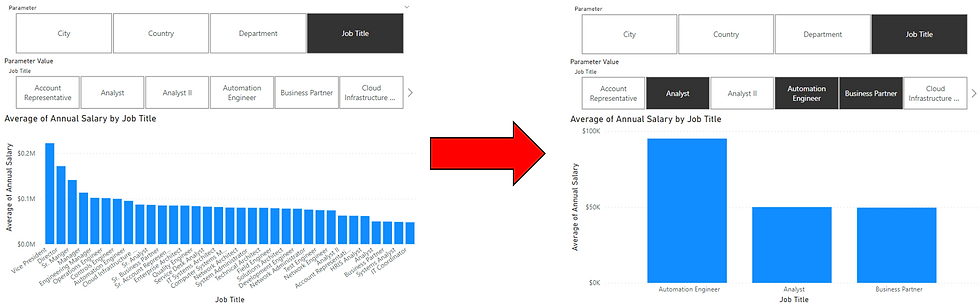
When the user switches the primary slicer from "Job Title" to "Country," the Parameter Value slicer will automatically update to show country values instead.
How This Differs from a Standard Slicer
A standard slicer only filters one field. If you have four dimensions, you need four separate slicers on your canvas. With the Parameter Value slicer, you only need two slicers regardless of how many dimensions your Field Parameter includes. The value slicer always reflects the currently active dimension.
Field Parameters and Matrix Hierarchies
If you're using a Field Parameter to switch dimensions inside a matrix visual, Power BI added a setting in the January 2026 update that controls what happens to expanded rows when the user changes the selection.
By default, a matrix now persists its expanded or collapsed state when you switch the Field Parameter. If a user has drilled into specific rows, switching from "Country" to "Department" keeps that same expansion level instead of snapping back to the top.
To control this behavior, go to File > Options and Settings > Options > Current File > Report settings, and find Field Parameters > Persist hierarchy level. Turn it off if you want the matrix to reset to the top level every time the user switches the parameter, which can be useful when the switched dimension has a very different hierarchy depth.
This setting only affects matrix visuals connected to a Field Parameter with a hierarchy. It has no effect on bar, column, or line charts.
Tips for Using Field Parameters Effectively
Name your parameter clearly. Users will see the parameter name in the slicer, so use something descriptive like "View By" or "Analyze By."
Use with bar, column, and line charts. These visual types work best with dynamic axes driven by Field Parameters.
Combine with Power BI bookmarks if you want to pre-set specific parameter states for different user personas.
Pair it with the Power BI zoom slider when the selected dimension has many values and the chart becomes dense at full scale.
Add Power BI report tooltips to give users extra context on each data point without cluttering the canvas.
Format the Parameter Value slicer as a horizontal tile or dropdown to save vertical space on the canvas.
Field Parameter in Power BI solves a common reporting problem: too many visuals for dimensions that serve the same analytical purpose. By creating a dynamic slicer with a Field Parameter, you give users control over what they analyze while keeping the report clean and focused. The Parameter Value slicer adds a second layer of filtering so users can drill into specific values within whatever dimension they have selected.
If your report page includes the parameter slicer alongside other filters, the Apply All Slicers button prevents each dimension switch from immediately firing visual queries, which is particularly useful when connected to a DirectQuery model.
Take Your Power BI Reports Further
Field Parameters are one of many features that make Power BI reports more interactive and easier to use. But building reports that are well-structured, performant, and scalable requires more than knowing individual features.
BI Solusi helps companies design and implement Power BI solutions that work for real business users, from data modeling and DAX to dashboard development and user adoption.
BI Solusi is your trusted partner for data-driven success in Indonesia, serving companies in the Southeast Asia region and beyond. We specialize in implementing cutting-edge Data Analytics, Business Intelligence platform, and Big Data solution, complemented by expert Data Science services.
We offer flexible nearshore and offshore BI implementation models to meet your specific needs and deliver the highest-quality results.
Our BI Consulting expertise encompasses Data Integration services (ETL), Data Warehousing, and the utilization of Data Visualization tools such as Microsoft Power BI, Qlik Sense, and Tableau for Reports and Dashboards implementation.
Let us help you unlock the full potential of your data and achieve your business goals.


Thank you for this highly informative article. I appreciate the efforts.