

Power BI New Card Visual: Turn Your KPIs into Stories

The Power BI new card visual lets one visual show many KPI cards, each with its own value, supporting context, status indicator, image, and conditional colors. For years the card showed a single number and a single label, so a dashboard with a dozen KPIs meant a dozen visuals to build, align, and maintain.
In this article, you will see what the new card visual does on a sample sales dashboard, how business users read it, and how developers configure it step by step.
What is Power BI New Card Visual?
The new card visual displays key metrics in a flexible format. One visual can hold many cards, and you control every part of each card: the value, the label, the shape, the image, and the supporting details.
Why It Matters for Business
The new card visual matters because one visual now carries the headline number, its comparison, and its status, so readers judge results faster and builders maintain fewer objects. The main advantages are:
One visual, many cards: Add a category field such as Segment to the Categories field well and the visual splits into one card for each value. Several segments no longer mean several separate visuals to build and align.
Built-in context: The headline number, a comparison to a prior period or target, and a status indicator all live inside the same card, so readers see immediately whether a result is good or bad.
Conditional colors that follow the data: Accent bars, labels, and status text can take their color from a DAX measure (a calculated field), so each segment gets its own color and a loss turns red automatically.
Icons and visual cues: Add an image to each card, or a rotated category label on the side, to make KPIs easier to scan and tell apart.
Faster, cleaner reports: The Selection pane shows one object instead of a stack of overlapping shapes, text boxes, and icons, and Microsoft notes that combining measures in one visual also reduces visual load time.
One design applied everywhere: Shape, spacing, and fonts are set once, and a report theme can carry those settings across the whole report.
Before the new card visual, creating a flexible and polished KPI layout often meant combining multiple report elements or relying on custom visuals. While these approaches could achieve the desired look, they also added complexity and could make reports less efficient and accessible.
Deep Dive into New Card Key Features
The new card visual has five features that cover most dashboard needs: many cards per visual, reference labels, shape and style control, flexible layout, and built-in interactivity. Each one is shown below on the sample sales dashboard.
1. Many Cards in One Visual
Add several fields to the Data well and each becomes its own card; in the order the fields appear in the well. With the multi-category layout, one measure can also be split into one card per category, such as one per Segment.
2. Reference Labels for Context
Each card can carry reference labels under the main value, made of a title, a value, and a detail. In our dashboard, every segment card shows its Profit Margin and a status such as "● Healthy".
3. Full Control over Shape and Style
Round each corner separately, add an accent bar, add an image or icon, and switch between light and dark looks. Settings can be saved in a theme, so every new card inherits the same look.
4. Flexible Layout
Arrange cards horizontally, vertically, or in a grid, and fine-tune padding, spacing, and alignment.
5. Built-in Interactivity
Each card supports tooltips, including report page tooltips, and drillthrough. Right-click a card and jump to a detail page for that exact value.
What Business Users See
If you read the dashboard rather than build it, here is how the cards help.
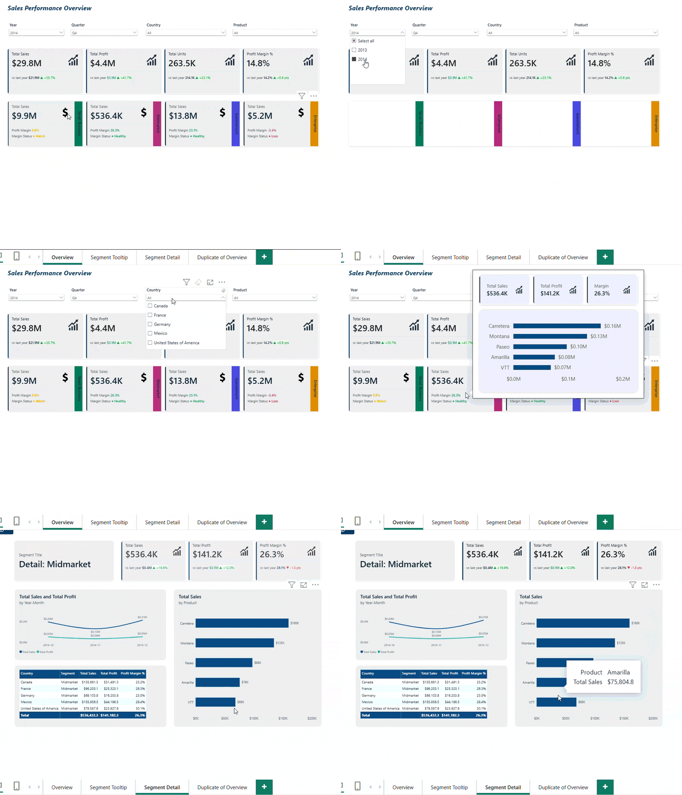
Top row: the big picture. Four cards show Total Sales of about 118.7 million, Total Profit of 16.9 million, Total Units, and a Profit Margin of 14.2%.
Second row: who is healthy. Each segment has its own card and a colored status:
Government: 52.5M in sales, 21.7% margin. Healthy (green).
Small Business: 42.4M in sales, 9.8% margin. Watch (yellow).
Enterprise: 19.6M in sales, -3.1% margin. Loss (red). This is the segment to ask questions about.
Midmarket: 2.4M in sales, 27.7% margin. Healthy.
Digging deeper. Hover over a segment card to see a tooltip with a mini summary. Right-click and choose Drillthrough to open the Segment Detail page, filtered to that segment.
YoY Comparison
About year-over-year. The 2013 data covers only September to December, so a fair comparison exists only for Q4. Filter to Q4 and 2014 sales are up 35.7% versus Q4 2013. For other periods, the card shows "n/a", which is expected.
For Developers: How to Build the Segment Card
The format pane of the new card visual is organized into eight sections: Multi-category layout, Category header, Multi-card layout, Cards, Callout, Image, Reference labels layout, and Reference labels. For the segment cards, four of them do most of the work.
1. Multi-category layout: how the cards are arranged
Set the style to Cards, choose 2 columns, and place the category header at the top. This section controls the grid, so change it first if the cards feel too wide or too cramped. The Category header section then styles the segment name above each card.
2. Cards: how each card looks
This is where card-level styling lives: a rounded rectangle shape, a light fill, and a 4 px accent bar. Use the Apply settings to selector when one card needs a different style from the rest. In our file, the fill is almost transparent (95%), so the accent bar and the numbers carry the design.
3. Reference labels: the context under the number
Add Profit Margin % as the first reference label and your status measure as the second. Each label has three parts you can style separately: Title, Value, and Detail.
Set the Title to custom text such as "Profit Margin".
For the Value font color, click fx, choose Field value, and pick your color measure. The label now changes color with the data.
We turned Detail off to keep the card clean.
4. Reference labels layout: how the labels are arranged
This section controls how the labels are organized inside each card, for example side by side or stacked. Switch it when you add a third label, and the card starts to feel crowded.
The other sections, briefly
Multi-card layout: Spacing, padding, and sizing for multiple cards in one visual. Our top-row KPI cards use a cell padding of 12 here.
Callout: The main number. The top-row cards use a 28 pt value and Show blank as is set to "n/a", so empty results are clearly labeled.
Image: Optional logo or icon for each card. We did not use it on this dashboard.
Real-World Scenario: One Dashboard, Two Audiences
Imagine a finance team reviewing quarterly sales across five customer segments. Using the new card visual, they:
Show all five segments in a single visual instead of five copied cards
Flag Enterprise in red the moment its margin turns negative
Use the tooltip for a quick look and drillthrough for the full picture
Let executives read the cards in seconds while analysts open the detail page
Executives and analysts see the same numbers at different levels of detail, in one report.
Build Your Power BI Dashboard with BI Solusi
If your monthly report still means exporting data from several systems, pasting it into spreadsheets, and rechecking the totals, the numbers are old by the time anyone reads them. The hours go assembling the report, and little is left for acting on it.
BI Solusi connects your data sources and builds Power BI dashboards that your team can open every day, with the figures already in place. If you are planning your next Power BI report, we are happy to talk it through.
Frequently Asked Questions
What is the new card visual in Power BI?
The new card visual is Power BI's current card, which shows many cards in one visual, each with a value, reference labels, an optional image, and conditional formatting. It became generally available in November 2025 and is now the default Card in the Visualizations pane.
Does the new card visual replace the old card visuals?
Yes, for new reports. It replaces the single card and multi-card visuals as the default, while reports that already use the legacy visuals keep working unchanged. To bring the legacy visuals back, select the three dots in the Visualizations pane and choose Restore default visuals.
Can the new card visual change color based on the data?
Yes. You can apply conditional formatting to elements such as font color, background color, and border color, for example to turn a margin red when it falls below zero.
Can I show an image or icon on each card?
Yes. A card can carry a small callout image, a larger top-level image, and a background image on its category header, and each can come from a data column so every card gets its own picture.
How do I keep the same card style across a whole report?
Save the card settings in a custom report theme file, and every new card in the report inherits them. The theme can carry settings such as padding and reference label background.
BI Solusi is your trusted partner for data-driven success in Indonesia, serving companies in the Southeast Asia region and beyond. We specialize in implementing cutting-edge Data Analytics, Business Intelligence platform, and Big Data solution, complemented by expert Data Science services.
We offer flexible nearshore and offshore BI implementation models to meet your specific needs and deliver the highest-quality results.
Our BI Consulting expertise encompasses Data Integration services (ETL), Data Warehousing, and the utilization of Data Visualization tools such as Microsoft Power BI, Qlik Sense, and Tableau for Reports and Dashboards implementation.
Let us help you unlock the full potential of your data and achieve your business goals.


Comments