
Anomaly Detection in Power BI: How It Works and How to Read Results
- admin

- Apr 10
- 4 min read
Updated: May 11
Anomaly detection in Power BI lets you find data points that deviate from normal patterns automatically, without building your own statistical models. This article covers how to enable the feature, adjust its sensitivity, and interpret the results, including the root cause analysis that Power BI provides.
What Is Anomaly Detection in Power BI?
Anomaly detection in Power BI is an analytics feature that automatically identifies data points deviating from expected patterns in time series visualizations. It helps business users spot unusual spikes or drops without manually building statistical models.
In everyday business data, anomalies can take many forms: a sudden surge in product returns, a drop in transactions during a specific hour, or an unexpected rise in operational costs. Power BI detects these patterns directly within existing report visuals.
When Is This Feature Useful?
Anomaly detection is most relevant when you are analyzing time-based data and want to identify points that fall outside expected behavior, including:
Monitoring daily or weekly sales performance to catch drops outside normal trends
Analyzing website or application traffic to spot unusual spikes
Tracking operational costs so budget deviations are caught early
Reviewing production data to identify process disruptions affecting output
The feature also includes root cause analysis, so Power BI does not just flag an anomaly but also provides potential explanations based on other dimensions in your dataset.
How to Enable Anomaly Detection in Power BI
Before starting, make sure you are using the latest version of Power BI Desktop. This feature is only available on Line chart visuals with a time axis.
Open Power BI Desktop and load your dataset.
Create or select the Line chart visual you want to analyze.
From the top menu, go to File > Options and settings > Options.
Select the Preview features tab and enable Anomaly detection.
Close the Options window and restart Power BI Desktop.
Return to your Line chart. In the Visualizations panel, select the Analytics icon (the magnifying glass icon).

Sample visual and Analytics subpanel Click Find anomalies, then press + Add.

Find anomalies and +Add button
After this, Power BI will process the data and display anomaly points directly on your visual.
Adjusting Detection Sensitivity
Sensitivity controls how strictly Power BI defines the boundaries of "normal." The value ranges from 1 to 100.
Low sensitivity (e.g., 50): The expected range is wider, so only large deviations are flagged. This works well for data with naturally high fluctuations, such as seasonal sales figures.
High sensitivity (e.g., 90–100): The expected range is narrower, so even small deviations get flagged. This suits data that should be stable, such as system response times or daily error log counts.
To adjust sensitivity, click the Find anomalies panel in the Analytics sub-panel and move the Sensitivity slider as needed. Changes appear on the visual immediately.


How to Read Anomaly Detection Results
Once the feature is active, Power BI displays anomaly points as small circles on the line chart, typically in a different color from normal data. The gray shaded area around the line represents the range of values the model considers normal.
Anomaly dot: A data point that falls outside the expected range at a specific date or time.
Gray zone (expected range): The value range predicted by the model based on historical patterns. A narrower zone reflects a higher sensitivity setting.
Arrow or vertical line: Indicates how far the data point deviates from the expected value at that specific point.
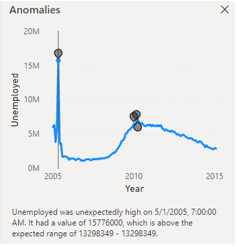
To see a more detailed explanation, click any anomaly dot. Power BI opens an Anomaly explanation panel listing the dimensions in your dataset that contributed most to the anomaly, ranked by their level of influence.
Root Cause Analysis in Power BI
Root cause analysis in Power BI works by comparing data segments at the anomaly point against normal patterns. Power BI identifies which dimensions or categories changed most significantly at the time the anomaly occurred.
For example, if Power BI detects a spike in unemployment figures on January 1, 2010, the Possible explanations panel might show that the 45–54 age group (58%) and the male population segment (37%) had the highest contribution scores.

This is a correlation, not a confirmed cause, so further investigation is still needed.
A few things to keep in mind when reading root cause results:
The explanations shown are correlations, not proof of causation. Manual investigation is still needed to verify any finding.
The more categorical dimensions (columns) in your dataset, the more detailed the explanations Power BI can generate.
If the explanations seem irrelevant, check whether the dimensions in your dataset are properly defined and have sufficient granularity.
Limitations of Anomaly Detection
There are a few limitations worth understanding before relying on this feature:
Anomaly detection only works on Line chart visuals with time series data.
The feature cannot be used on data without a time dimension.
The underlying model is automated and cannot be customized algorithmically. For more complex needs, anomaly detection using Python in Power BI with libraries such as PyCaret is a more flexible alternative.
Root cause analysis quality depends on how complete and well-structured the dimensions in your dataset are.
Optimize Power BI with BI Solusi
Understanding features like anomaly detection is a solid starting point, but getting the most out of Power BI for real business needs requires more than enabling built-in features. BI Solusi provides Power BI training for your team and end-to-end implementation services covering data architecture, dashboard development, and integration with your existing systems.
If you want Power BI reports that accurately reflect your business needs and support reliable decision-making, the BI Solusi consulting team is ready to help.
BI Solusi is your trusted partner for data-driven success in Indonesia, serving companies in the Southeast Asia region and beyond. We specialize in implementing cutting-edge Data Analytics, Business Intelligence platform, and Big Data solution, complemented by expert Data Science services.
We offer flexible nearshore and offshore BI implementation models to meet your specific needs and deliver the highest-quality results.
Our BI Consulting expertise encompasses Data Integration services (ETL), Data Warehousing, and the utilization of Data Visualization tools such as Microsoft Power BI, Qlik Sense, and Tableau for Reports and Dashboards implementation.
Let us help you unlock the full potential of your data and achieve your business goals.


Comments